Link to the project's GitHub repository
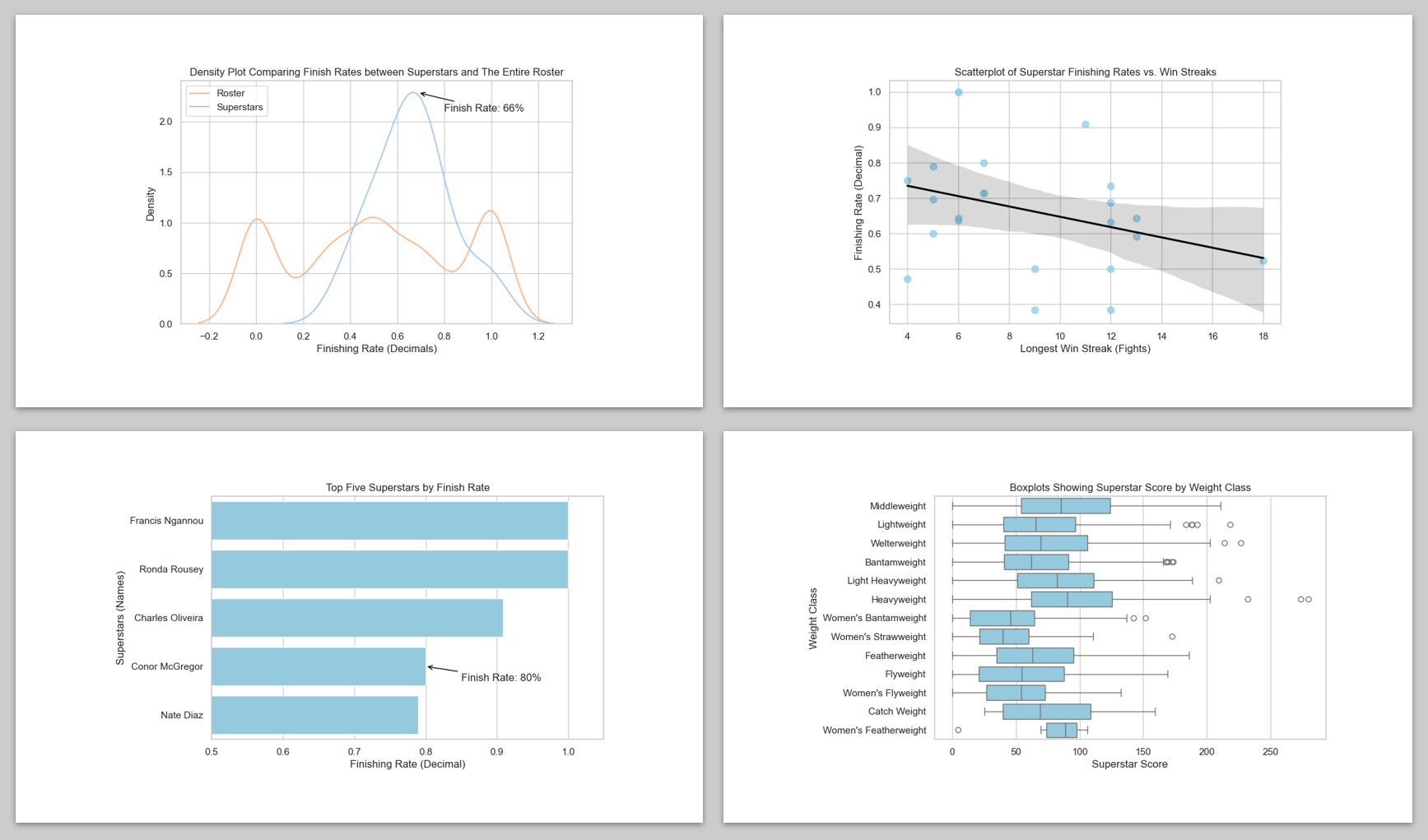
The Pareto Principle suggests that 20% of the input drives 80% of the results. In MMA, that 20% consists of the sport’s superstars.
This project identifies these prospects using historical data from UFC Fighters (2010 – 2024).
Traits such as arm length, winning streaks, and finishing rates were used to compare superstars with average UFC fighters. Weighting the different traits based on their association with superstars,
the “Superstar Score” was created. This function intakes raw fighter info and outputs a singular score used to determine a fighters superstar potential.
Visualizations were critical in defining the story of a superstar. Side-by-side boxplots helped compare superstars with average UFC fighters.
Scatterplots allowed for correlations to be found or disproven between variables, and bar graphs allowed for more detailed analysis on individuals leading the pack in certain traits.
Tools
Python • Pandas • Matplotlib • Seaborn
Python Skills Used
Data loading • Data wrangling • Defining functions • For-loops
• If-else statements • Feature engineering • DataFrame/Series manipulation • Matplotlib plot creation
• Seaborn plot manipulation
Statistical Skills Used
Descriptive statistics • Comparative analysis • Correlation visualization • Trend visualization
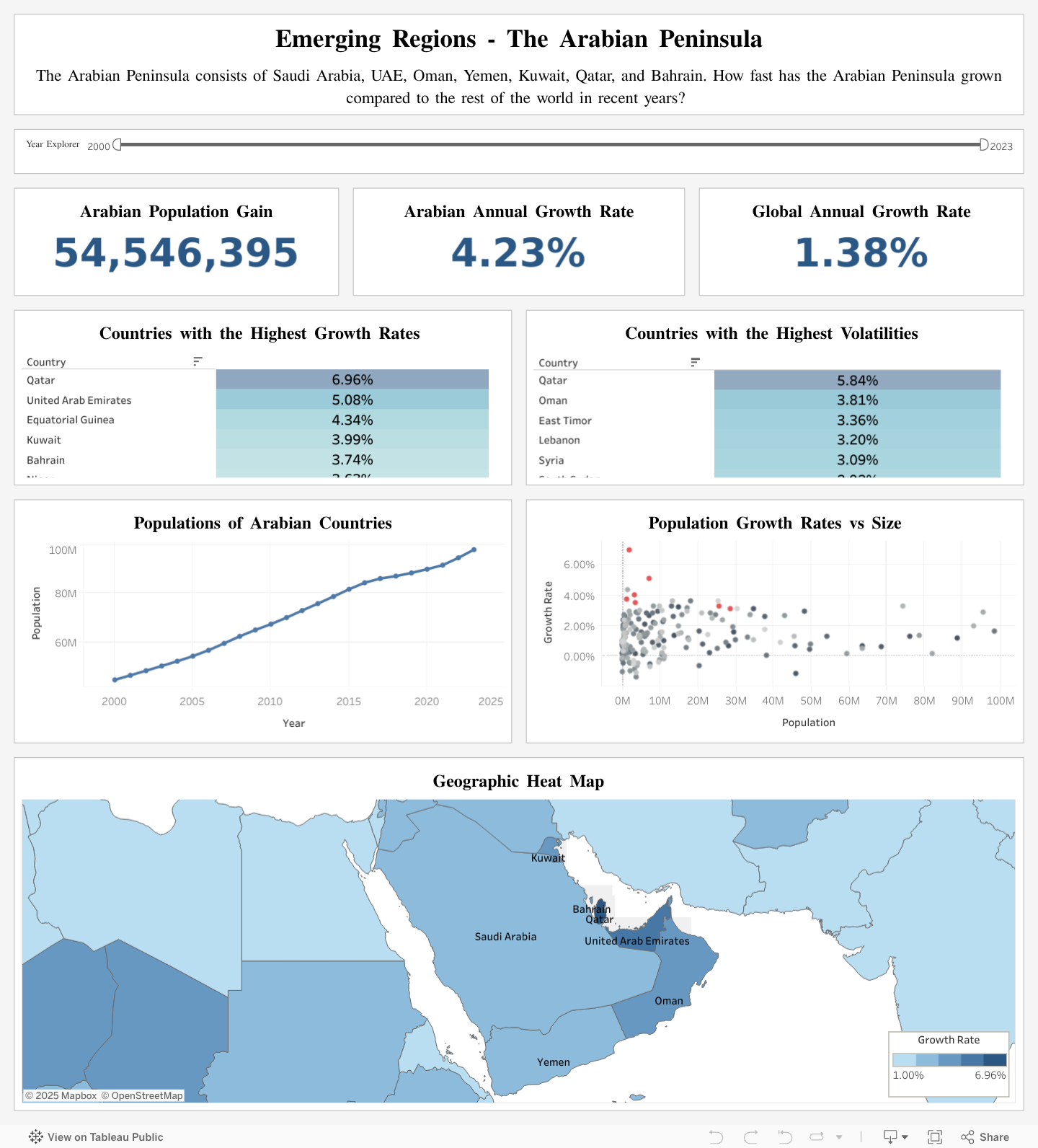
Global Populations: Emerging Regions Project
Link to the dashboard on Tableau Public
Link to the project's GitHub repository
This project's first phase aimed at using SQL to clean, transform, and analyze global population data to find the out fastest growing countries/regions in the world.
This raw dataset contained yearly populations for every country beginning in 10,000BC. The initial cleanup process involved filtering out all non-countries and
removing years with inconsistent population data. Next, obtaining the yearly growth rate for each year of every country led to the conclusion that the
Arabian Peninsula currently has some of the fastest growing countries in the world.
This takeaway was used as the inspiration for creating a Tableau dashboard covering this region of the world. Transformed datasets were uploaded to Tableau to be
datapoints for different KPI's, visualizations, and maps. These metrics all highlight the difference between the Arabian Peninsula's growth rate compared to the
rest of the world. This dashboard is interactive and allows the user to filter by year.
SQL Skills Used
Data cleaning • Data transformation •
VIEW statements • JOIN clauses • Subqueries • Window functions
Statistical Skills Used
Descriptive statistics (Mean, Standard Deviation) • Compound Growth Analysis
Tableau Skills Used
Interactive filters • Geographic Visualization •
Data Grouping • Time-Series Analysis
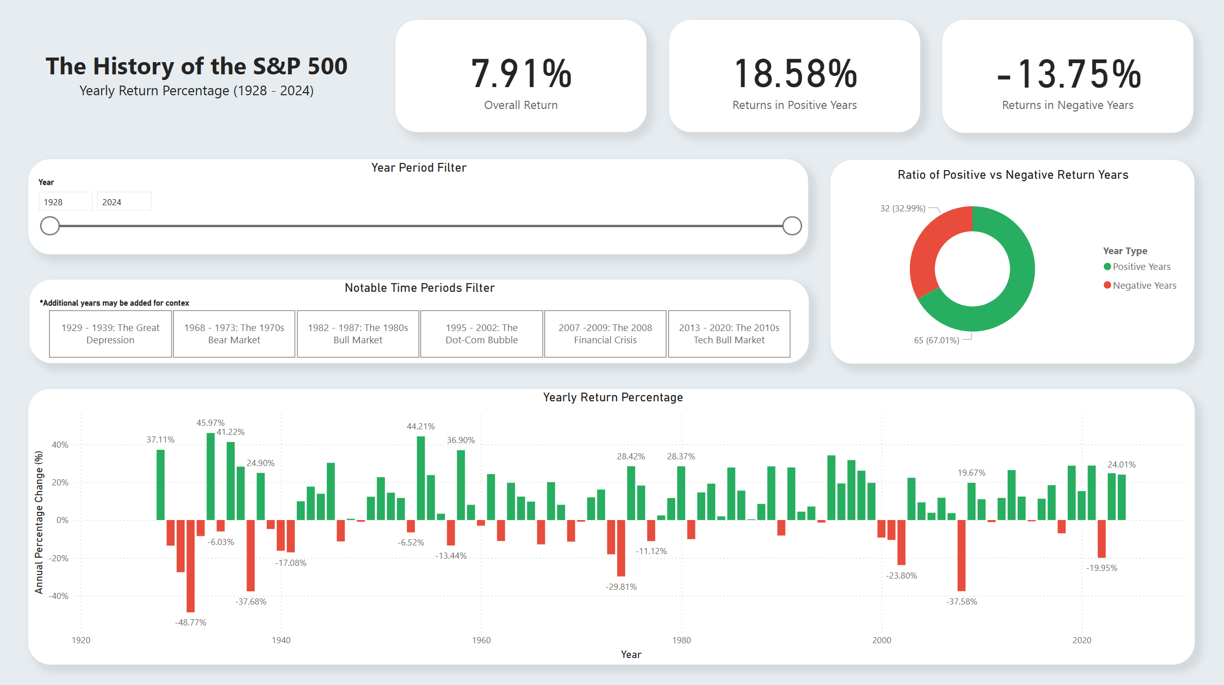
S&P 500 - Historical Analysis Project
Link to the project's GitHub repository
This project allowed me to turn raw numbers into an actionable format, then use it to display the data’s visual story.
The first half of this project consisted of this transformation process, where I used SQL to group daily index prices into yearly averages.
I then organized these numbers into a table fit for visualization. I connected my database with Power BI and began choosing the visual format
in which these numbers could be shown. The result is a dashboard which gives a glimpse into the S&P 500’s expansive history, along with insights
into some of the most famous US market crashes/bull runs. This dashboard encourages interaction and creativity. The full, interactive dashboard
is available upon request.
SQL Skills Used
VIEW statements • CASE expressions • JOIN clauses
• Common Table Expressions (CTEs) • GROUP BY clauses • Aggregate Functions
• Subqueries
Power BI Skills Used
Interactive Slicers • Dynamic Visualizations • Conditional Formatting
• Data Grouping • KPI Cards • Time-Based Filtering
I'm a Bay Area native who is pursuing an MBA degree at San Jose State University.
This portfolio was made to showcase my evergrowing skills as a data analyst, and I'm going to
continue adding projects to this portfolio as I grow in the field. I'm excited to
continue showcasing what I know and how much I care for data science!
.jpg)